
Documenting a Monstrous Failure.
In which I make a rubbish drawing and have a bit of a moan about Etsy

There are two routes an artist selling prints online can take.
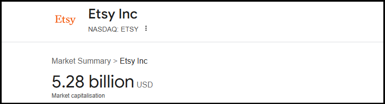
The first is ‘low price - low margin - high volume’ which accounts for the bulk of art found on Etsy, where the going rate for an A4 digital print is about £10. If you take this route and use a print on demand service like Gelato to fulfil your Etsy sales, you can expect to make about £1 to £1.50 profit per sale.
If you print at home and handle packaging and shipping yourself, the profit margin goes up to about £1.50 - £2.50 per sale, however this comes with its own set of risks. Something as innocuous as dropping a sliver of packing tape that lands on a finished print can mean you need to remake it, with the extra ink use and sheet of paper wiping out any profit you would have made. Clumsiness aside, the main issue with taking this route is the ‘high volume’ part of the equation - the whole enterprise only makes sense from a commercial perspective if your art style has the kind of broad appeal that will result in hundreds of sales.
This brings us to route number two: ‘high quality - low margin - low volume’. You might wonder if I’ve mis-typed that because it doesn’t seem to make sense, but no, it was intentional, and it’s sort of the point of this introduction (I’ll shut up soon and get to the drawing failure).
If you make traditional art and put hours of work into each piece, it stands to reason you would want reproduction prints made of that work to look as good as they possibly can. This entails scanning at high resolution (requiring a high spec ((expensive)) scanner), a lot of clean-up work and colour correction for specific paper profiles, followed by professional printing with archival pigment ink on acid free rag or cellulose paper. The result is a gallery quality giclée print that looks and feels beautiful.
I use a pro print shop well known for making extremely good giclée prints and I am very happy with the work they do, but it’s not cheap. Production, packing and UK shipping of each A4 print costs me £22. I sell these prints through Etsy, who take a listing fee, sales commission, and payment processing fee which combine to about 12% of the item price. My prints are currently listed on Etsy UK for £40 each plus shipping, and even at that price I still only make about £12 per sale.
£40 is quite a lot to pay for print by a non-famous artist and that, coupled with a niche style, means that despite the physical quality of the prints, I don’t sell many of them, hence high quality - low margin - low volume.
The net result of all of this is that I have come to understand and appreciate the movement away from online sales and towards in-person markets that is currently happening within in indie art community. Remove Etsy fees, shipping, and the cost of bullet proof, mail-friendly packaging, and suddenly profit margins shoot up to the extent that it’s possible to lower the cost of your prints - therefore making it more likely you will sell them in the first place.
And this, finally, brings me to the actual subject of this post. I want to start doing art markets and craft fairs, but don’t have enough finished pieces to fill a stall, so I spent this week away from developing my story project in favour of trying to create a finished artwork that could become a print (sorry it took so long to get here, I’ve got a bee in my bonnet about this subject).
Monstera Obliqua
I decided to draw a monstera plant for this piece. Monstera are a popular subject for artists, who usually choose to draw the gigantea species which have big, broad leaves interspersed with neat, regular notches (there’s probably a word the notches, but I don’t know it). I prefer the obliqua species, which has narrower leaves that are full of ragged and irregular holes. I always think obliqua plants look as though they’ve been on a 3 day bender in Las Vegas, and there is something almost skeletal about obliqua leaves that I thought might suit my style. I started my usual process in the usual way, by creating a Pureref panel for reference, and then sketching some composition thumbnails.


It was at this very early stage that the drawing started going wrong. You can see that in most of my thumbnail sketches, I used solid leaf shapes to sketch out the composition. This was intentional at first, I thought ‘just use basic shapes to get the placement right, then work out what to do with the gaps and layering’. The problem is, I eventually forgot about the gaps and layering, and didn’t figure out how I would render them in the final drawing.


As you can see from the pencil outlines, the composition looks fine with solid leaf shapes, but adding the gaps makes it fall apart. The ‘under’ leaves need more overlap, so that the parts viewable through the ‘over’ leaves makes sense, or there should be no overlap at all. I recognised this mistake when I inked the outlines and background and could tell the drawing was going wrong, but decided to press on and see if I could render my way out of a corner.
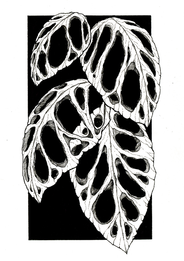
There are a bunch of problems with this. First, while the composition with solid leaves filled the frame nicely, the holes make scene look too empty and because I had already inked the background, I couldn’t fix it by adding stems or stalks. Secondly, the parts of the lower leaves visible through holes in the upper leaves don’t look ‘separate’ enough. It’s difficult to tell what’s what. I decided the only way to fix this was to give the left hand side of the leaves a solid colour to represent shadow.
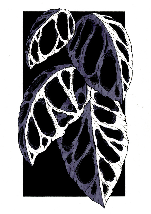
I used an Ohuhu alcohol marker to add the grey shade, and I think it looks kind of ok on the top three leaves because their arched shape makes the shadow make sense. But the very bottom leaf is flat and the shadow don’t work, it looks like I painted half of it then gave up. I could probably fix this by adding some very dark cast shadow elements on the lowest leaf, but there is another, unfixable problem with the composition.
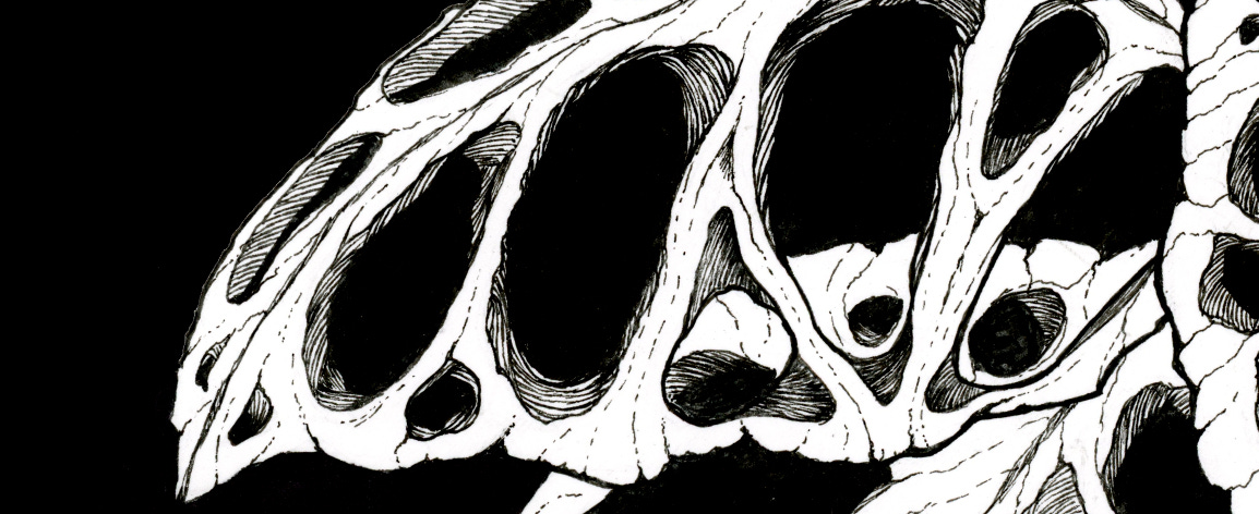
The cropped, close up section of the black and white version of the piece at the very top of this page looks pretty cool. The texture and fault lines in the leaf’s surface are clear to see, and they draw the eye around the piece, making the viewer wonder ‘is this a plant? Is it a bone, or a fossil?’ It’s interesting to look at.
That effect is entirely lost in the full size version of the drawing because the textured parts of the leaves are too small. I composed the image in such a way that the thin textured strips, which were supposed to the drawing’s focal point, fill about 20% of the frame, and even then they are too small for the texture details to be impactful.
All of the issues with this drawing stem from the same initial mistake of using solid shapes to finalise the composition. I broke my own cardinal rule - never draw something for the first time in a piece that’s meant to go up on the wall.
If I had made thumbnail sketches of layered leaves with gaps and notches in them, I would have realised this composition didn’t work for the subject, then found one which did.
So, lesson learned, and on to the next one. I’ll try this subject again, with a composition more like the header image at the top of the page, because I still like the idea of drawing a plant that looks like it’s been on a 3 day bender in Vegas.
If you would like to support my work without committing to a subscription, you can buy me a coffee here.
Giclée prints of my illustrations are available on Etsy.